Friday 17 December 2010

Evaluation

In what ways does your media project use, develop or challenge forms and conventions of real media products?

All images in this post can be clicked on to display them in their full size.
Any text with a hyperlink will take you to what is being described, such as a music video or website.
Typically, music videos use a number of conventions which help them stand out from other video production.I tried to make my music video use and develop as many conventions as possible, making it fit perfectly into the music video world. I also wanted it to challenge some, as I don't believe that all conventions are suitable for all genres of music. The cutting in most music videos is very fast, sometimes with shots lasting less than a second before the next one is shown. This creates very quick and interesting videos as locations and angles can change in seconds, creating very eye catching scenes. A good example of the fast cuts is in the Basshunter video that I analysed as part of my pre-production research, where 179+ shots were used in a 3 minute video. Obviously not all styles of music fit this convention, as slower songs obviously fit better with videos that cut at a similar speed. For example, a slow love song such as a Michael Buble song wouldn’t fit well with a dance style video, where cuts take place every second.

There is one convention, however, that fits every genre of music. This is the use of close ups. Nearly every single music video contains numerous close ups of the main character/singer/band. The close ups are used to familiarize the audience with who they see on the screen, allowing the audience to relate to what they see and feel more involved in the video, as well as allowing them to recognise the stars if they were to see them again. This is used to help get the name and face of artists or bands out to the public. For example, if a new band were to release a song and accompanying video without using close ups of themselves in it, then viewers wouldn’t be able to recognise the band as well as if they had used close-ups. This allows people to recognise who they see, even if they are in different circumstances, such as on TV or on a magazine cover. This recognition may prompt the viewer to buy the magazine or watch the programme 9, gaining the band/artist publicity. Below is an example close up from Sum 41; Pieces.


Another typical convention of music videos is that they are nearly always well lit. This makes colours clear and stand out and makes the video easy to watch as the audience don’t have to strain to see what is being shown. However, some videos and genres of music opt for a darker scheme, such as night time shots. Even in these videos, the main character/singer/band are always lit to make them stand out and contrast from the darkness. An example of this is in Katy Perry’s latest single; Firework, where she is singing at night.


The video we, Ashley Grantham and I, created follows these conventions pretty well. We decided that as the video would be for a relatively unknown band, if they were to have a music video then they would feature in it themselves as a way to get their faces known. However, Ashley and I also wanted to use an actor in our video as we feel the band are very down to earth and would prefer to be recognised for their music not just the images illustrate. We decided that as a compromise, we would film the chorus’ as the band singing, and the verses would feature an actor portraying the story of the lyrics. I feel that the final effect that the switching style gives is very suitable to the genre of music and the song itself, as the audience believe that the band are singing about a past relationship, or someone who they know, and the actors are just personas showing the story. To show that the band are singing about what is happening in the verses, we filmed the chorus against a whiteboard and lit it so that large shadows would be cast against the background in a very stylised way. The artificial lighting created an interesting effect that made it seem as though the singers could be in, or be a brain, thinking over memories (verse), due to the seemingly empty place that the singers are. However, it also reflects the lyrics, suggesting that emotionally and physically, the character is now alone (“I feel like a deep sea diver”). The large shadows help show the dark place that the lyrics are describing and help the video and song fit together. This follows the theory of Dyer, who believed that there should be lots of light on set and on the artist/band. Setting up the lighting for this shot originally caused me some problems as the lighting meant that the singers were over exposed. To get around this, we decided to bounce the light off table tops which left the singers sufficiently lit. As we were inside for the chorus shooting, we were able to use only artificial light sources, creating the exact effects that we wanted, however, the verses and outside shots were significantly harder and did cause us some problems. This challenges common conventions as typically, most music videos are well lit. However, Ashley and I thought that it would seem surreal if it was brightly lit outside as we wanted the video to have a natural look. We decided to film at an early time on an autumn day to get the natural ‘crisp’ look that wildlife gets as we thought it would fit well with the genre of music. Most of the shots we took came out as we had planned, but we did have trouble with one. When filming the low angle shot of the character sat on the fence, the sun had risen right behind him, causing the aperture on the camera to close itself. This caused the shots to be dark and made it hard to see detail on the characters. To try and counter this, when editing our video, Ash and I tried to alter the lighting effects on Sony Vegas. We altered the brightness, contrast and numerous other settings until we got the best we could out of the footage we had. We also decided to alter the contrast on all of the outdoor shots, making the colours more vibrant and clear. There are two noticeable shots that we altered. The first is in the first verse where the camera pans across the hillside and there is some glare coming off the windows on one of the distant houses. Originally the shot was plain with no real lighting point, but it looked bland and so to liven it up, I added a lens flare and animated it so that it moved with the camera and looked realistic. The second noticeable point is in the instrumental and is the final slow motion shot. I decided that the shot would look better with a bright glow as it emphasised the contrast between the dark and light sides of the shot. Special effects are also rarely used in this genre of music video, so I wanted to challenge it as I felt that the contrasting effects would fit really well with the song. The male character is walking towards the light, whereas the female is going to the dark. This shows that he has risen above her cheating on him and is better than her. I think that this is shot is really good as it helps show what has happened brilliantly as the colours and effects combine to create a really eye catching shot. We were unsure whether or not the inside shots of our actor reading the phone should be lit by artificial lighting. We wanted to use the artificial lights solely on the chorus as they have a distinct difference to natural lighting. We were aiming to get the verses all similarly lit, and have the lighting in the chorus’ stand out. In the end we decided to use the natural light from the windows and the ceiling lights in the room to brighten the shots. This turned out well, as the scene is lit very well and looks natural without being over or under exposed. Overall, I believe the lighting in our shots to be very good, especially the chorus’. I like the effect that we got on the chorus as it helps to show that the singers are the band as it is lit much differently to the rest of the video. However, the outdoor natural lighting challenges the well-lit convention as the lighting isn’t focussed on the characters and is instead spread over the entire scene. Due to how we wanted the chorus’ and verses to contrast each other, we chose the lighting to both fit with and challenge the music video conventions.


In our video, we tried to follow the close up conventions to help show the characters and singers. However, for our chorus shots, we felt that it would be help enforce the idea that the singers are trapped in their/the memories. By not having other angled shots, the chorus was boring to watch, which music videos are not. We decided that to liven it up, we would swap over the places for the videos on the screen. For example, we change the lager area of the screen from Ash singing one line to myself singing the next. The same happened for the two smaller squares, so we decided to switch them over every so often to make it more interesting. This challenges the conventions as typically, music videos and their choruses are filled with close ups of the artist/band as a way to show who they are and to get them recognised. We managed to use more close ups in the verse sections of the video, with close ups on the female crying and the male’s face when he is looking at the phone. Hopefully this will help the audience to see and relate to the characters easier as they are constantly being shown them. This follows the general conventions as typically we are shown lots of close ups. Overall, my video develops the conventions and flips over how they would generally be used. We went for the stylised chorus to make the singers stand out, rather than through the use of close ups, whereas we used the close ups on the characters in the story that the lyrics represent.

Another convention that we really tried to follow as Ashley and I felt it was important, is flow. Typically, videos flow with the music that they accompany, as it would look odd if an extremely fast part of a song was played over long takes. Therefore, Ashley and I tried to follow the flow of the track closely when planning the video. We have two long takes that fade over each other in the slow build up, followed by average pacing throught the rest of the song. The only part of the song that really required a change in pace was in the instrumental half way through. The instrumental is extremely fast and hectic which we felt required a huge flurry of images to be thrown at the viewer. We decided that a flashback sequence would fit well, cutting some of the shots and repeating them to follow the beat. The overall result looks really fitting as the video changes with the music.


Finally, we decided that the genre of music and our choice of song wouldn’t be fitting with a very fast cut video. We decided that we would use reasonably long shots and cut between them to create a pace that matches the music. This is best seen in the long take of the male walking that fades from the couple walking, compared to the fast cuts in the mid song instrumental where we cut and repeated small segments of clips to make it seem really hectic. Overall, the mixture between long takes and quick cutting gives the video a very nice flow, as the song builds up, so does the video until we reach the loud instrumental and all of the memories flash past, reminding the audience of everything that had happened previously.
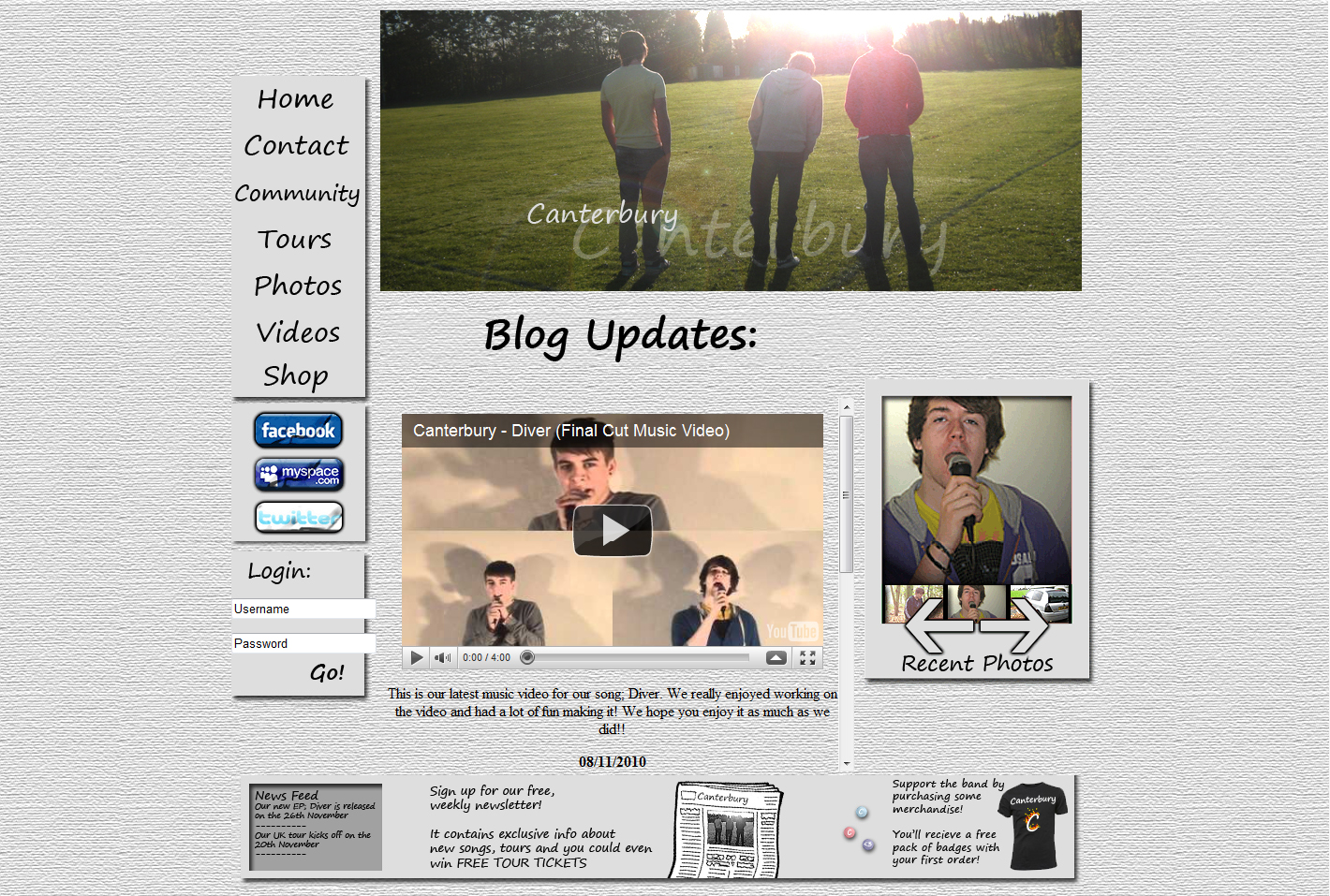
To follow conventions for the CD cover, I decided to have the band name as a large text, whilst the CD name is underneath in a smaller font. This clearly shows who the band are and what the CD is called which helps the audience when they see it on a shelf. The website follows suite, with the band name along the top of the page clearly displayed so people instantly know whose website they are on. I used an extremely bright colour scheme for the CD cover to help it stand out, whilst I used a bright, grey background and scheme for the website. This helps both stand out from the rest of similar products/sites and can really help people remember the band. I decided that I wanted the website to be well organised, using columns as the main way of keeping the page neat. This is a common convention of websites, as it makes it extremely easy for users to navigate the site. My first column is the main navigation bar, and contains the main links to other site pages. Underneath is a social networks link, which takes the user the social page of the site. Here they would be provided links to follow the band on sites such as Facebook and Twitter. This is another convention with modern music websites as it allows fans a quicker way to find out more about the band, as social networks are becoming increasingly popular. Finally, there is a log in box, which would be used be site members to allow them access to special features. The box is linked to the community page, which would contain special photos, videos and information for site members only. This is a common convention with band websites as it promotes people to join up, which in turn results in more potential purchasers of the bands merchandise, tickets and songs.


How effective is the combination of your main product and ancillary texts?

To go with the video that Ash and I created, I decided to make a six panel CD cover as well as an insert to go with it and a website homepage. I decided that I wanted to keep as much continuity throughout my work as possible. This resulted in me checking over the lyrics thoroughly to find specific lines that I could use. In the end, I decided that the most notable and stand out line is “I’m on fire when I’m in the sky”. I therefore decided to create an image of a man flying whilst on fire and used it on the CD cover underneath the title.


 As a way to further emphasise the metaphor, I added flame effects to the Canterbury name. To continue with this effect, I decided that further continuity could be created with the website buttons. I made the link buttons roll over images so that when the mouse hovers over them, the text changes to have a flame effect. I believed that if someone who likes the band were to realise the links between lyrics and images, then they would be very impressed with the effort that was put in to make everything link together. Another area that I tried to create continuity in was in the art style. I decided that I wanted bright colours and a hand drawn font and style to make everything stand out from the often dark and abstract images that are often used on similar genre CD covers. I started planning the style by creating the mock up CD case. I created it using block colour and drew it all on Adobe Photoshop. I was originally planning on using a photo and altering the colours using photo editing software such as Photoshop. However, I really liked the look of the bright colours mixed with the cartoon style as it combined to create a really eye catching and unusual art style. I decided that I wanted my final CD cover and website to follow a similar, hand drawn sort of art style, and so used a paper effect background on the website along with a font that looks like handwriting.


 This helps link the two pieces of work together well and I think that it looks great having continuity between them. I really wanted to try and continue the style onto my video, but as we had already decided what we wanted the video to be like, we struggled to find somewhere to fit it in. In the end we decided that as the video suggests that it is memories, we could add an animated area to the beginning that used stills from the video as photos. This created an interesting effect as it is as though the audience are seeing through one of the characters eyes, allowing them to relate even further with the characters. After we completed our first draft video, I toyed with the effects to create a cartoon art style trying to create something that would fit in with the bright colours and cartoon vibe that the CD cover gave off. However, the effect didn’t look as good as I originally thought it would and so I reverted the video back to its default settings. To try and emphasis to the colours, I added contrast filters which helped the colours to stand out from one another, as well as making the footage itself look like a higher quality than it really was. Below is an image of before and after I altered the contrasts and colours. At the top is a still from the final video while underneath is the original footage.


I also used my CD cover and website to help promote the band. I thought that because the band are relatively unknown, it would take something other than a photo of them to catch people’s attention as they wouldn’t be recognised. This resulted in my use of bright, cartoony colours on the CD cover, which would hopefully help grab people’s attention if they were to see it on a shelf in a shop.


The artwork would be a talking point for the band, as people would discuss it with each other due to its unusual design. This would gain them yet more recognition and could potentially lead to greater recognition as people may then go their website to find out more about them. Following conventions, CDs tend to have a photo of multiple photos of the band members inside them. I decided that following this would also help gain the band recognition, but I didn’t feel that the band were all about fame and fortune. To compensate for this, I decided to use a photo of Ash, myself and another male facing away from the camera. This showed that the band doesn’t want to be known for who they are, but for the music they make. I also had links to the bands website and MySpace pages written on the inside cover. This would help to promote the band further as people who liked the music may be inclined to go on the links to find out more about the band. I used the same photo for the header of the website as I felt it helped show who the band are without being too 'in your face'. I edited the photo to add some text with the band’s name and altered it to look as though the people in the photo are in front of the text. I think that this turned out to look really eye catching as it is a really subtle way of making the picture look good and making the band stand out. Another way that I decided to show the band was using a photo slider on the right hand column. The slider would be linked to all of the photos on the site and when one of the arrows would be clicked, it would cycle through them. The website goes further to emphasise the band. There are links to tour dates and pages that give information about the band, which goes together to create a site that subtly promotes the band to viewers. I think that this is more enjoyable for the audience as it doesn’t seem commercialised as though the band are only interested in getting your money. Overall I think that the CD cover, website and video all go very well together to create an effective combination that promotes the band without putting too much empahsis on the band themselves. I think that this would be very popular in todays modern music industry where labels and artists try to milk as much money out of audiences before they are forgotten, due to the constant flow of new artists.


What have you learned from your audience feedback?

I have learned a lot from audience feedback on the video, CD cover and website that I created. During the creation stages, I got feedback on the draft videos, CD cover and website that I had created so that I could improve them as much as possible to make them appealing to my target audience.

The first item that I got feedback on was my very first draft version of my video. After completing the editing stage, I uploaded the video to YouTube as a way to distribute it amongst my friends. This made it easy for them to watch in their own time as they could access it whenever they were free. I also played the video to the rest of the class using a projector so I could get some feedback straightaway. My other feedback gathering was on my third draft video. I went through the same process as before, uploading my video to YouTube to distribute it amongst my friends. After gathering all of my feedback, I updated and edited my video to accommodate the suggestions.


My video went through a number of stages until it was completed, with four drafts being uploaded to YouTube before I uploaded a final edit. I got feedback on my first and third drafts as myself and Ash checked over the second and fourth videos. Overall, this process seemed very good at removing as many imperfections as possible as the audiences noticed different faults to Ash and I, as well as providing us with some new ideas on what we could add or alter in the video. The feedback we got from the first draft was very constructive. We were told that the intro sequence, where the two shots fade over each other was very good, and they liked the idea of a boyfriend and girlfriend splitting up. I believe that this is one of the best shots in our videos as it sets up the audience and subtly tells what the story will be about. However, people were generally quite bored by the chorus as the shots don’t change fast enough to keep people interested. This was a very fair point as there were only about 5 cuts in each of the chorus’. Ash and I decided that we would re film the chorus’ with both of us singing so that we could cut between us. Another clear problem with the chorus was that I was chewing gum whilst performing, resulting in clear mouth movements in between lyrics. This was easily rectified by a re-shoot as we were already planning. Another piece of feedback that was repeated by numerous reviewers was in the choice of font for the band and track name. Generally, people thought that it was far too big, suggesting that a thinner font would suit much better. Ash and I both agreed that this was a good point, and we decided to change it in our next draft. The next video of ours to be reviewed by the target audience was the third draft. We followed the same technique and received very good feedback. We were told that the only real bad parts of the video was in the use of close ups, and the lack of them. The problem Ash and I now had however, was that we were no longer able to film new footage due to a change in weather making it impossible to get similar lighting and look about the shots. This was due to our late filming, as we left it late to film which now meant we had no extra time to do any re-shoots. The next piece of feedback was that people really liked the repeated shots in the mid song instrumental. They said that it helped remind them of what had previously happened and that it fit extremely well with the song. Ash and I took all of the feedback we received on board and altered our video. We then created a fourth draft and altered tiny parts that we noticed still needed altering until we finally reeled out the final cut. Overall, I believe that the feedback we received from our target audience was very positive, and any negative points they had gave us constructive feedback that allowed us to further improve the video. I feel that we could further improve the video if we had started filming at an earlier date. I believe that we should have included more close ups of the characters in the storyline. This would have meant that current shots would be shorter which would increase the actual number of shots and make the video faster and more interesting.


I also got feedback on my CD cover. After creating my mock up design, people in the class who saw it told me that they really liked the art style and asked me if I was going to keep it. Originally I was only planning on using a panoramic photo, however, all of the comments persuaded me to keep the bright and eye catching style. Once I had the CD cover in a semi complete state, with most of the basic design and artwork complete, I asked some of my target audience what they thought of it so far. The general feeling was that the art style was very unique and eye catching and people said that if they were to see it on a shelf, the aesthetically pleasing art style would make them interested in the CD. I agreed that the art style was very unique and the comments persuaded me to keep going with the cartoony style as I was receiving positive feedback from the target audience. I thought that the style would grab most people’s attention and so the cover would be doing a very good job at promoting the band. There is one thing that I am disappointed in was my use of photos. I feel that I should have included more photos of the band on the inside, as the rear facing shot could be replaced by multiple individual photos that show the band better.


 I also got feedback on the website as I created it. I showed it to my target audience to receive some ideas on what I could alter and improve. Originally, I was going to use a similar background from my CD cover on my website, but feedback I received was not very good. People thought that it made the website look childish, rather than eye catching like the CD cover. I agreed with these views as typically, backgrounds for band websites are plain so the viewer’s focus more on the important parts. To carry on with my continuity, I used a paper effect to make the website seem like a note pad, which fit in well with the hand writing font. People were also impressed with the buttons I used, and the flame effect that they recognised from my CD cover as it showed links between the different forms of media. There are some parts of the website that I am not too happy with. For example, I wish that I had made all of the buttons that go in the left hand column the same size, because it looks odd having the login button stretched to fit, and the social network button being thinner than the rest. I would also do the head different, as I think it would look better if it were to fade out at the bottom rather than being a solid rectangle.

How did you use new media technologies in the construction and research, planning and evaluation stages?

New technologies helped greatly in the different stages of development for my video.
Below are links to some of the websites that I used frequently during my project.
YouTube
Wikipedia
Blogger
In the research stage, I used the search engine Google to search for information on theorists, and the huge online encyclopaedia; Wikipedia to find out in more detail about conventions, genres and other related information. The internet helped me greatly as I was able to quickly search for information on what I needed, making it much more efficient than reading through books to find small chunks of info. The internet also came in useful when it came to me finding a track to use. I used it to search for band websites which I would then search for contact details so that I could email the band or record company, asking for permission to use a song. Without the internet, it would have been even more difficult to find a track as I would have needed to search for local bands, rather than bands from anywhere in the world.


To distribute our video, we uploaded it onto the website YouTube. YouTube allows people to share their videos for free, allowing us to upload the music video, and then ask our friends to find it and give us feedback. This was extremely effective as it meant that people could watch and give feedback on our work when they were able to, meaning we gained more feedback than if we were to do a screening at a certain time. YouTube also allowed me to embed the video on my blog which allowed me to write about them better as the reader would be able to see what was being described. Overall, this technology made it extremely easy and efficient to distribute our music video, as well as helping us get feedback on what we could improve.


Another new technology that has helped me was the Blogger website where I uploaded all of my work. Blogger allowed me to present all of my work online, meaning it can be easily seen and marked by my teacher and examiner. It also allowed my partner to see what I had done, for example, uploading a new video would remind him that he needs to also upload his. This allowed us to easily keep track and remind each other of what we need to do. Blogger also allowed me many other advantages over offline portfolios or hand written ones. I was able to easily place links to other sites, such as when I state what song I will be using, I place a link to the song and embed a YouTube video so that it is clear what I am talking about. I am also able to easily insert images to further show what is being discussed. This makes it clear exactly what I am describing and helps the reader understand me better.


The final set of new technologies that I used was the latest software on the computers. I used Sony Vegas 9 to do the editing and effects for the video, and Adobe Photoshop and Dreamweaver to create my CD cover and website. These technologies helped me to create the best work I could as they have great features added with every update. The advancement in editing technolgies has greatly imrpoved the work that bands have been able to create. As programs have evolved, it has become much easier to create great looking work, especially the capabilities of Photoshop. Photoshop allowed me to download custom brush styles to create unique effects that weren't even possible a few years ago. Due to the internet, people are able to create custom fonts and then share them with the world. The same goes for brushes, plugins and other customizeable effects, creating a world wide custom content community. Often the custom content is released for free which is great for audiences as they can see much more variety. The same goes for Sony Vegas, where custom plugins can be used to create new effect styles. The cartoon effect that I tried out was the New Blue Cartoonr. Overall, the constantly improving editing software that is available greatly improves the work that band are able to produce. The ease of use and possiblities get better with every update which ultimately creates a better viewing experience for the audiences.

Overall, the new media technologies helped greatly in the creation of my project. The internet was without doubt the most important area as I used it constantly to research, compare, share and gain feedback. The improved software programs also helped me as they allowed me access to numerous features that allowed me to create good looking work.

Completed Videos:
Final Cut
Rough Draft 4
Rough Draft 3
Rough Draft 2
Rough Draft 1

My YouTube Channel
My A Level Media Playlist

Friday 26 November 2010

Final Website Design

As my website is not live yet, I am unable to have a full link to it. Therefore, this is the file path for Mr Turner to get to it on my College account hardrive:

H:\Media A2

Overall, I am very pleased with my website as it contains nearly everything that I wanted to include. I managed to include the continuity of the song lyrics and CD case styles, such as hand drawn effects and the fire references. Again I believe that this will make people who notice the links very impressed as they wouldn't really be expecting everything to link together.

However, some of the site isn't as good as I hoped. At first, I wanted the buttons to all match up with the background but file restrictions and formatting prevented me from completing it as I had originally planned.

The one part of my site that went fully as planned was the blog part in the centre. I created a scroll bar which makes the page look really professional, as well as embedding my final music video and writing up some blog posts to show what the site would be like if it was real.

Below is an image of the website that I created, please click it to see in full size.

Final Video Edit


This is our final edit for our music video for the band; Canterbury, and their song; Diver. After reviewing the song's lyrics, Ash and I decided that the song was about a person who had split up with their partner who had been cheating on them. We decided that we wanted to make a story driven video that showed what the lyrics were saying, hence the boy and girl characters. From our draft work, we decided that we definitely wanted to keep the hand drawn/ photo album opening that we came up with when storyboarding. This suggests that the video is memories from looking at the photo album and follows the idea that the song is about two people's relationship.

The first shot that is shown is the long take of the couple walking, which eventually fades out to show just the male on his own. This straightaway shows that the video is about a couple who have split up. The next major decision we made was to try and link the images with the audio at the same time, such as the line "you should see this view", we show the pan of the hillside. This helps the audience relate to what they can see as the lyrics are represented. Another part of the video that was specifically chosen for how it was, is the instrumental after the 2nd chorus. We decided that it would be the right time in the song to show some flashbacks into what had previously happened to remind the audience what they had already seen, as well as showing the new hand held shot of the female as though you are seeing through the male's eyes. We used a black and white filter to create the flashback effect, as this makes the instrumental stand out more and helps to suggest that it is not continuing with the story shown in verse 1 and 2.


The chorus went through a few different stages before Ash and I settled on the final, 3 sections that are in the video above. Originally it was only going to be me singing, but it was too boring to watch, even with multiple angles. We therefore decided to try cutting between us both but again it was still slightly boring. Finally, we came up with splitting the screen and playing 3 different videos simultaneously. I am very happy with the final chorus design as it is unusual and like the intro, is a part of the video that really stands out as being slightly different.

Overall, I am very pleased with the video I created. I enjoyed making it, especially the editing side as I loved figuring out which clips to put where and what other effects to use. The video came out with a good style I think, due to the photo album intro and the chorus sectioning.

Tuesday 23 November 2010

Final CD Case Designs

These are my final designs for my CD Case cover and insert. Underneath each picture I will describe what it is showing and why I have made it how it is.

This is the outside cover for the CD insert, this is the booklet that will contain the lyrics to each song on the EP. This is the outside covers, front and back. The front contains the CD title with the band name and a photo of our actors. I edited the photo so there was no background and added some filters to make the picture look more hand drawn to fit in with the style I was going for. I wanted the insert to look hand drawn, as though it was written by the band on some paper. This is why I chose the paper style background with a wooden table effect border.

This is the inside example of what it would be like inside the insert. The pages are supposed to be like a book, with the hand written style linking into the theme I was going for. I also added the background again so that it looked like a piece of paper on a table. The font helped to make it seem handwritten as it is quite a sans serif font.

This is the outside of the CD cover. The left panel is what would be the inside flap, the centre panel is the back and the right hand panel is the front cover. As can be seen, I went for a bright, cartoony style case to grab the audience's eye and draw them into the CD. This would help promote sales as they would hopefully be interested in the artwork. To create continuity throughout the video and CD case, I took certain lyrics and used them to inspire some of the artwork. As can be seen, the wide angled picture of the cartoon man looking out across the hills is similar to the shot and lyrics in the music video; "you should see this view from up here". Another bit of inspiration came from the lyrics; "I'm on fire when I'm in the sky". This inspired me to add some flame effects the floating writing and add a small image of a burning stickman underneath it as a bit of extra decoration. These small parts of continuity would impress purchasers when they release the links between the artwork and song.
The photo on the inside flap was used to try and make the audience see the band without it seeming as the band were being shoved in their faces. This makes it seem as though the music is more important than the band themselves, creating a nice, down to Earth vibe about the band. To make it seem like this, I decided to use the behind shot of myself, Ash and Robert. The photo is good because after I added some effects and neatened it up on Photoshop, it was really easy to tell who was who, without the in your face style that a lot of bands go for.


This is the inside cover for the CD case. The left side is the reverse of the front cover, the centre is where the CD is held and the right hand panel is the inside cover of the flap. As can be seen, the inside follows the same art style as the outside, adding more continuity. The CD also uses the same style to make it match into the background it is held on. I used the same font and text from the front cover, including the fire details, and placed them on the CD, making it clear who and what the CD is. I also added the cartoon man onto it to give it more detail as it was still rather plain with just the text. Finally, I created the background so that it matched into what was behind it. This created a nice 3D effect as it looks like the CD is part of the case, until you take it off and you are left with the plain green hills behind it. The inside flap contains a message that would be written by the band. It is a short thank you message to the customers which again makes the band seem very down to Earth and shows that they appreciate you purchasing the CD. It also contains a few related links, such as the band's MySpace site, main website and the company they are signed to. I also added a small promotional code onto the message panel to again link the product to the website.


Finally, the panel on the left is where the CD insert that contains the lyrics to the songs would go. As can be seen, the black lines would be extra material to create a pouch that would hold the booklet. This helps keep the booklet safe and in good condition, as it could be quite easy to lose.


Overall I am really pleased with how my CD covers and insert have turned out. The digipack has got exactly the feel and art style that I wanted when designing it and I believe that the small pieces of continuity between the lyrics and art really help make it stand out. The bright, cartoony styled art does as intended, and grabs people attention because it is unusual and contrasts against a lot of other CD artwork. This would hopefully help to promote the band due the unusual style.

Wednesday 17 November 2010

Rough Draft 3


This is our 3rd draft video. We have ironed out as many problems as we can and have now decided on the final small parts that need to be edited. We are going to re film a slight part of the chorus section so that when we have the large and small boxes, the person in the large box has another video of them singing from a different angle in the small box. This will hopefully give the video more variety and hopefully will look better. We will also create a small intro sequence like we had originally planned, with the video being played in a book as though they are moving photos.

Sunday 7 November 2010

Rough Draft 2


This is our second draft video. As can be seen, we re filmed all of the verse parts and added different text for the intro. We realise that we have some problems with the lighting in a few shots and that the chorus is still a bit boring and we shall be updating that in a third draft.

Wednesday 3 November 2010

Re-Filming

Unfortunately, our original female actor has had to drop out of the video as she has her own work to complete as she has been away recently and is behind. Therefore, Ash and I decided to change actors altogether.
Annie will replace the female character, whilst anotehr male named Ash will replace my group partner.
I have written a list of the shots that we will shoot and re-shoot so that it is easy for us to get it all done.

Intro sequence:
Annie and Ash walking along a path
Ash walking along above path
Verse 1:
Tilt down from the sky
Annie and Ash smiling and laughing walking along a pavement (front and back)
Annie and Ash holding hands walking
Annie and Ash holding hands close up
Ash sat on a fence, Annie below him
Over the shoulder looking at Annie below
Annie climbs up next to ash
Pan of the hill
Over Annie’s shoulder, Ash turns and smiles
Hug
Verse 2:
Ash sat on chair, using a phone
Zoom on ash using phone
Over the shoulder shot of ash using phone
Insert of phone screen
Ash gets up and storms out of the room
Ash pushes annie
Annie crying
Instrumental:
Ash gets off the fence and walks away
Annie and ash walk opposite ways on a path, annie stops and turns around ash keeps going


Friday 22 October 2010

Rough Draft


Here is the rough draft edit of our video. Obviously it isn't perfect but we will be spending time re filming parts and filming new shots. We shall create a list of edits and changes that need to be made so that we know exactly what needs to be done.


This is the location of my website: H:\Website

Wednesday 20 October 2010

Filming Finished

Today, Ash and I finished filming the footage that we will use for the verse parts of the song.

We went outside with a camera and tripod and got our female actor (Catherine). I set up the shots that we would need and directed Ash and Catherine as to what they needed to do. We choose a good time of day to do the filming as the sun was quite low in the sky which caused nice looking, long shadows and also gave the characters a good colour.

Again we filmed multiple shots and angles and made sure to use a number of takes to eliminate any problems that may be caused.

We then came to the argument scene where Ash and Catherine had to pretend to have a fight. They acted very well and the shot looked very good. Once this was done we went inside to film the remaining scenes, including a close up of a mobile phone that we would use as an insert.

We after filming all of the parts, Ash and I returned to the computer room where we again captured the footage ready to edit it all together.

Wednesday 13 October 2010

Filming Started

Today, Ash and I started filming the footage that we will use for the chorus parts of the song.

We went to the empty classroom that we decided we were going to use and set up the camera, tripod and lighting as we wanted it. We did run into a problem with our camera as we had trouble finding where to set the white balance, although we did eventually sort it out.

I had brought a microphone with me to pretend to sing into to make the video look more professional, as if I had just stood there singing then it would probably have looked strange.

Ash used the camera and I acted, and we filmed a number of shots from multiple angles so that we could edit them together so it wouldn't be boring. We also took 3 takes for each angle in case any of any problems. This meant that we had backup takes that we could use if there were camera movements of problems with the footage.

We eventually finished filming all of the chorus footage and went back to the computer room to capture the footage so that we could edit it at a later date.

Wednesday 29 September 2010

Schedule

5th October – Start filming the chorus


6th October – Finishing filming the chorus

12th October – Start filming the verses

13th October – Finish filming the verses

15th October – Start editing the clips together

22nd October – Hand in draft copy


30th September - 22nd October - Create CD cover and band Website

Friday 24 September 2010

Risk Assesment

Rain – Damage to the equipment like camera and tripod. May also ruin the filming locations such as the grassy field.
Protection: Film in dry conditions and make the best we can during the time. If rain is unavoidable, shelter the equipment with an umbrella.

Pedestrians – Be in the way of shots.
Protection: Make sure the area is clear and kept clear during the filming.

Hazards in the Grass – Hurt the actors when filming the grass scenes as hard or sharp objects may be hidden.
Protection: Check the area thoroughly before filming.

Tripping Over Wires – Someone may trip over the wires that will be coming from the microphone when the actor is singing.
Protection: Wrap the wire up so that it is smaller and not obstructing the floor. Warn people of the potential hazard.


We have very few risks as most of the filming will be done in out of the way places. This will keep us away from potential hazards and allow us the best chances to do what it is we are each location for.

Required Items List

This is a list showing all of the props, items and actors that we will require throughout the entire project.

Filming Equipment
-Video Camera
-Tripod
-Blank Tape
-Digital Camera

Props
-Mobile Phone
-Paper Note Pad
-Microphone

Actors

-2 Male
-1 Female

Costumes
-Male 01: Jeans, t-shirt and hooded jumper
-Male 02: Jeans, t-shirt (light coloured)
-Female: Jeans/leggings, t-shirt, hooded jumper

Computer Software
-Adobe Photoshop
-Adobe Dreamweaver
-Sony Vegas

Locations
-Empty Classroom
-Grassy Field
-Pavement/Path
-Females Bedroom

Mock Website

This is our design for a mock website. Again we have kept the hand drawn style, which will mean in the final version a hand written font will be used, as well as the grey boxes having a lined paper effect. The background has a textured effect to make it look like paper.

The layout is similar to the Sum 41 site that I analysed. I liked the general layout of the site as it looked nice and everything was easy to find. I also thought that the columned style navigation bar would be nice on a lined paper effect background.

The photo slider idea was taken from Pendulum's site as it is a good way of showing who the band are, especially useful for Canterbury as they are trying to get their name out there.

The store box on the bottom right is a mixture between Sum 41's and Pendulum's. It will contain a mini navigation bar that flicks between music and merchandise like pendulums, but the photos will show the item in use.

The central column is the same idea that is used on the Sum 41 site. It will contain news about the band, tour dates and upcoming events, as well as links to videos of the band and other related articles. This would be the main part of the site and so needs to be detailed and well laid out so users understand how to use it fully.

Wednesday 22 September 2010

Mock CD Case

Below is our mock-up of what we want our CD cover to look like. We decided that we wanted to go with the idea that we are going to use in the video that gives it a hand drawn look and feel. Therefore, we won’t use photos for the cover, and draw everything using Adobe Photoshop. This will give it a good effect that would make it stand out on a shelf and the bright colours we will use should help catch the audience’s eye. It also fits in with the light style of music that the band creates.


This is the outside cover of what the case would look like. The left is the flap that folds inside to cover the actual CD. The middle area where the track listings are will be the very back and the right with the band and EP name will be the front. All of this will be drawn using Photoshop to create a nice style. On the back panel is the main character that will be in the video, except he will be drawn rather than photographed. He will be facing away from the audience as though he is looking out across the sky. This fits in with the feel of Diver, which we will be making the video for.


This is the inside cover of the CD. The centre is where the disc will be held, hence the different art style and surrounding brick wall effect to separate it from the rest of the picture. The right is the inside of the flap and contains the information about who produced the record, when and where, as well as a special thanks message that the band would have written. The left panel is blank but contains a reference to the song: Diver. One of the lyrics is "I'm on fire, when I'm in the sky", and the picture has a small figure in the sky which is on fire. This small detail is important as it shows that there are links between the art and the songs.

Tuesday 21 September 2010

Storyboards

Below is our complete storyboard. Please click on each picture to get an enlarged view.

As can be seen, most of the song has been covered as to what we shall do, and the chorus parts will use the same footage so we only made a storyboard for the two versus, chorus and the extension to a chorus.

Obviously, whilst filming our ideas might change or we may get new ones so the final version won’t look exactly like this, but it is a rough idea that will still be seen in the final edit.